Dempsey Ewan is a Brooklyn-based graphic designer specializing in creating and implementing brands and systems.
In her free time she helps edit and publish a risograph zine, Big Mess
Info
Floral Design
Instagram
LinkedIn
Floral Design
St. Ambrose University
St. Ambrose University is a small Catholic institution in Davenport, Iowa. They came to SimpsonScarborough with a request to help broaden prospective student awareness. They lacked the verbal and visual tools to effectively communicate who they were, within their own campus and externally.
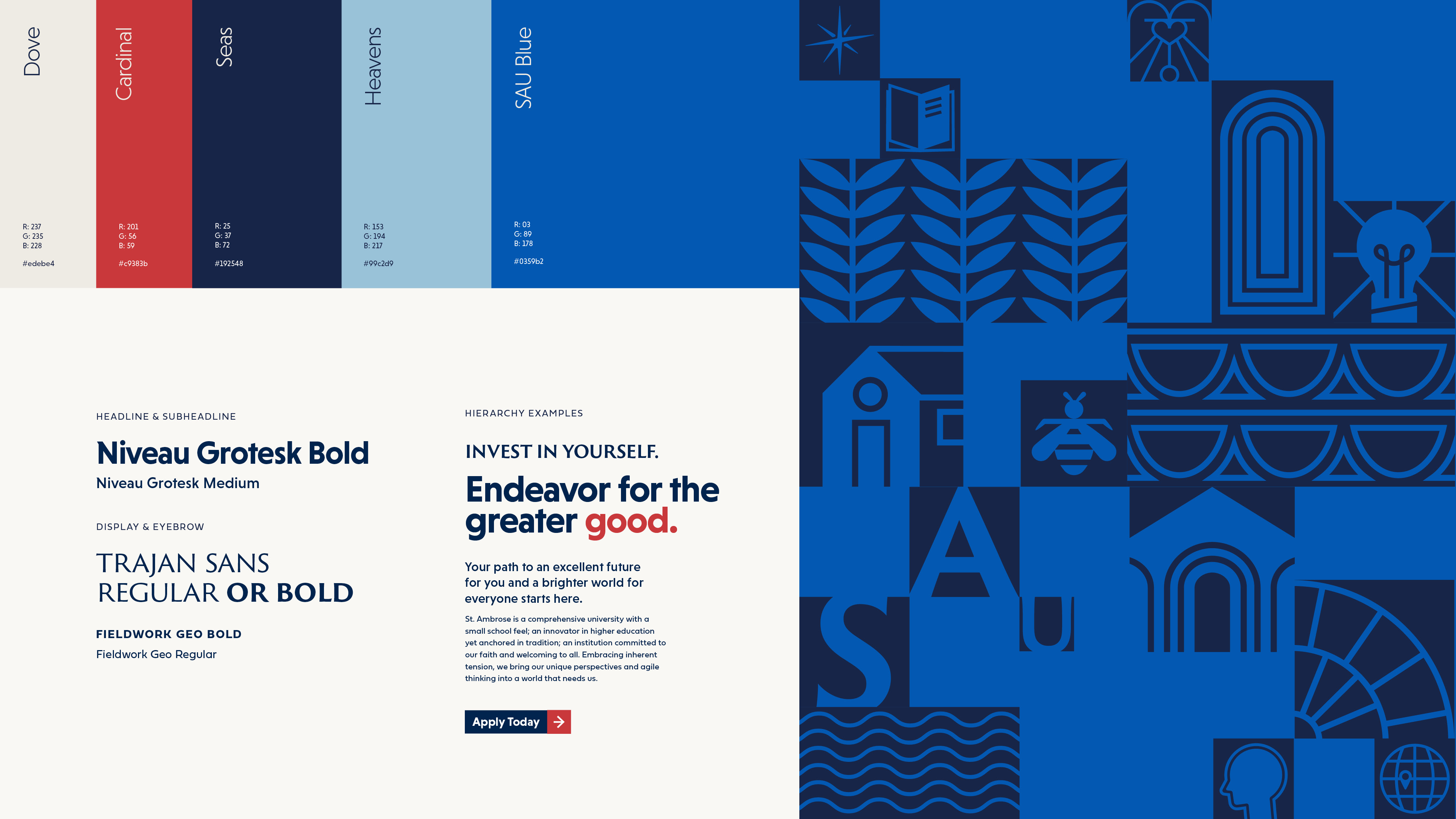
During our inital discovery, we learned that St. Ambrose was the home of long-time faculty Edward Catich, a priest, calligrapher, stonecutter, artist, who famously did important work on the typeface that later became the Trajan Serif. His artwork filled campus and gave a unique midcentury look to the signage and decor of many buildings.
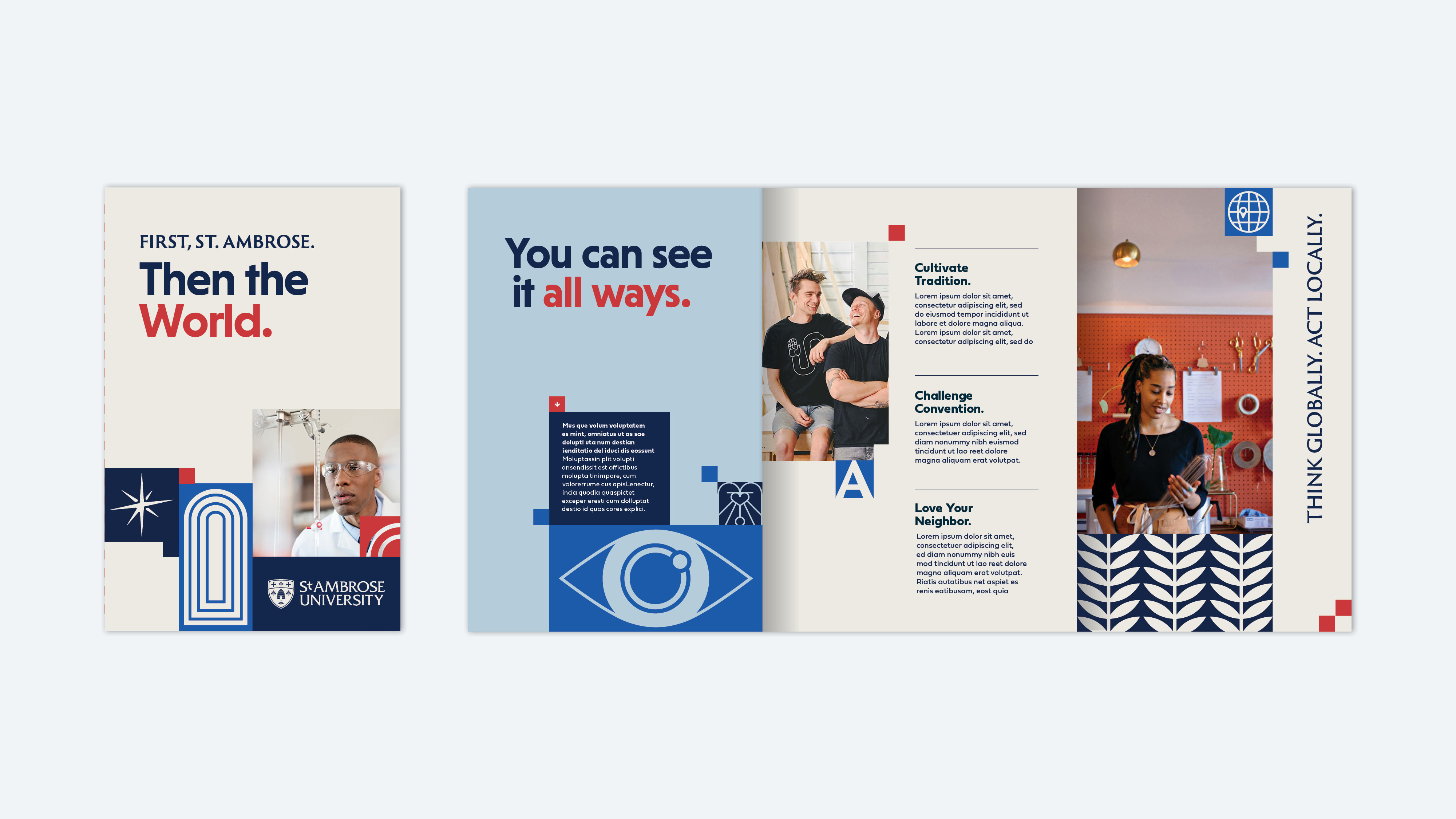
Drawing inspiration from a unique visual precedent, we developed a visual and verbal style that paid homage to their special history while updating it to feel modern and new.
After the new brand launched, St. Ambrose’s new student enrollment is up 15% year-over-year, and first year student retention hit a 10-year high.
Strategy
Our strategy for SAU was centered around three pillars that spoke to:
These unique pillars supported a larger framework that created a structure with which to communicate all aspects of SAU and guide our creative concepting. Our final visual system had icons representing SAU’s campus and history as well as the greater community and geographical surroundings. It also leaned into representing real, human emotion and the virtues of the Catholic life.
During our inital discovery, we learned that St. Ambrose was the home of long-time faculty Edward Catich, a priest, calligrapher, stonecutter, artist, who famously did important work on the typeface that later became the Trajan Serif. His artwork filled campus and gave a unique midcentury look to the signage and decor of many buildings.
Drawing inspiration from a unique visual precedent, we developed a visual and verbal style that paid homage to their special history while updating it to feel modern and new.
After the new brand launched, St. Ambrose’s new student enrollment is up 15% year-over-year, and first year student retention hit a 10-year high.
Strategy
Our strategy for SAU was centered around three pillars that spoke to:
- Embracing Tonos (Tension)
-
Being In/With/For the Local Community
-
Pusuing Human-Centered Results
These unique pillars supported a larger framework that created a structure with which to communicate all aspects of SAU and guide our creative concepting. Our final visual system had icons representing SAU’s campus and history as well as the greater community and geographical surroundings. It also leaned into representing real, human emotion and the virtues of the Catholic life.
Client
St. Ambrose University
Services
︎︎︎ Strategy
︎︎︎ Brand Expression
︎︎︎ Identity
︎︎︎ Brand Roll-Out
Role
Senior Designer
St. Ambrose University
Services
︎︎︎ Strategy
︎︎︎ Brand Expression
︎︎︎ Identity
︎︎︎ Brand Roll-Out
Role
Senior Designer

During our team’s on-campus discovery, we conducted interviews with various groups of faculty, staff, stakeholders, and students using custom visual and verbal exercises.
After this visit we compiled our notes and findings and shared them out with our team. Using this data we built an extensive Miro board where we collected further inspiration, shared in-progress work, and orchestrated the flow of tactical expressions for the concept presentation itself.
After this visit we compiled our notes and findings and shared them out with our team. Using this data we built an extensive Miro board where we collected further inspiration, shared in-progress work, and orchestrated the flow of tactical expressions for the concept presentation itself.
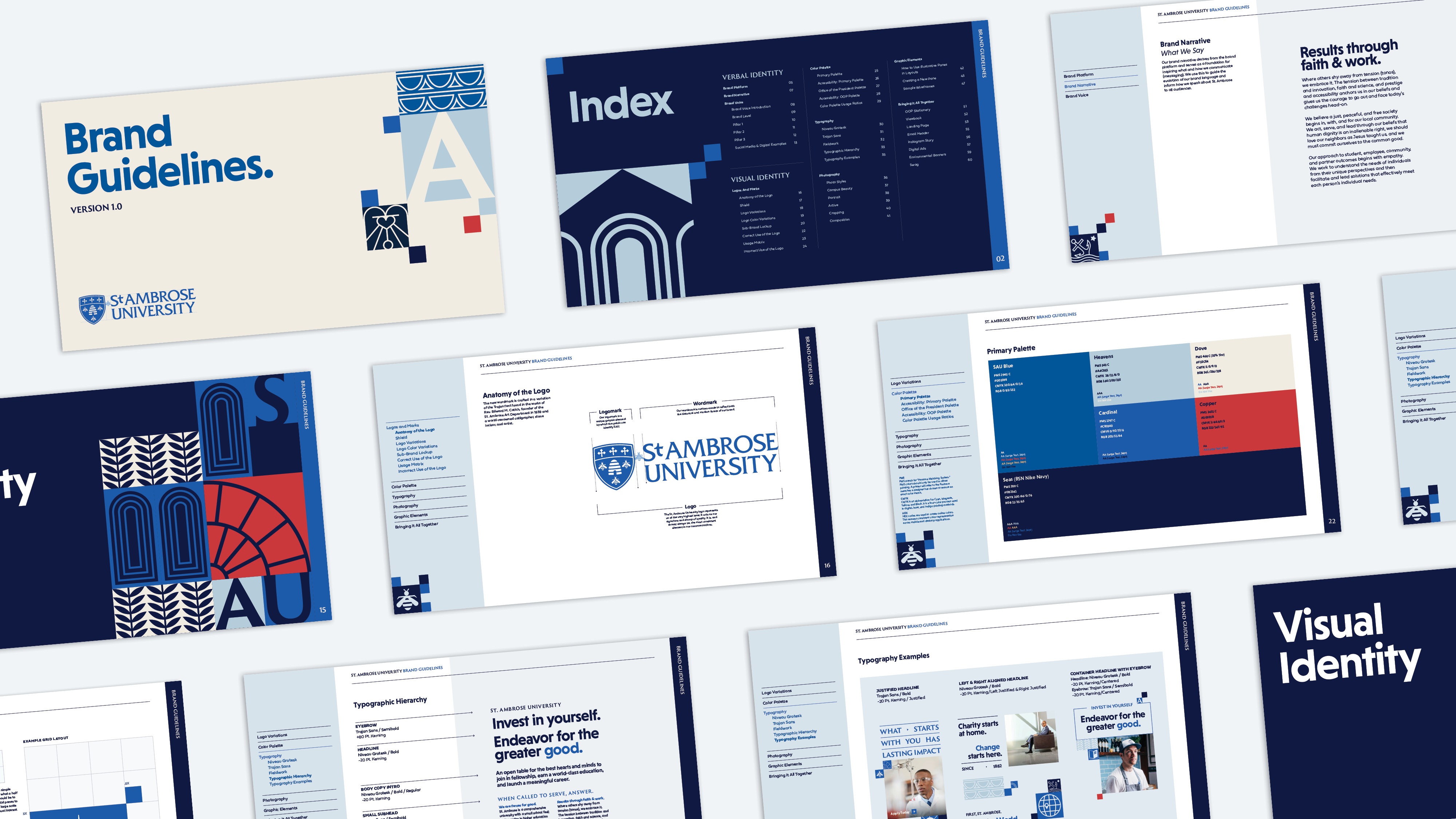
With such an ownable visual precedent, we created a system for SAU that incorporated Trajan Sans and included a series of modular icons inspired by Father Catich’s artworks.
This carried the special midcentury feeling of campus through to the visual communication as well.
This carried the special midcentury feeling of campus through to the visual communication as well.


Created at: SimpsonScarborough
Collaborators: Emily Barriball, Katie Schwendeman, Jason Shough
Thank You